Authentic8
Brand Design
I joined Authentic8 shortly after a significant branding overhaul and took ownership of all design materials, maintaining consistency across every touchpoint. The brand is built around the concept of "Separating the things you care about from the things you cannot trust,” the idea at the heart of their core product, Silo for Research.
Silo for Research is a cloud-based browser built for cybersecurity analysts to conduct research across the surface, deep, and dark web without compromising their identity.
Tools



Color
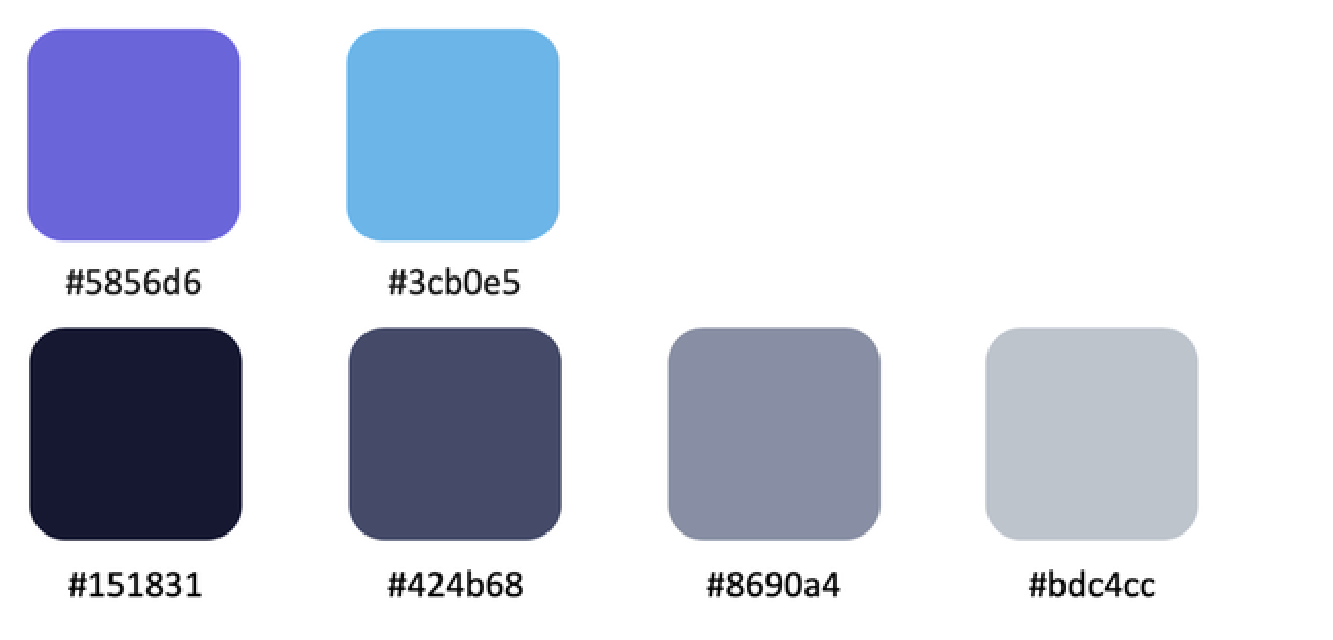
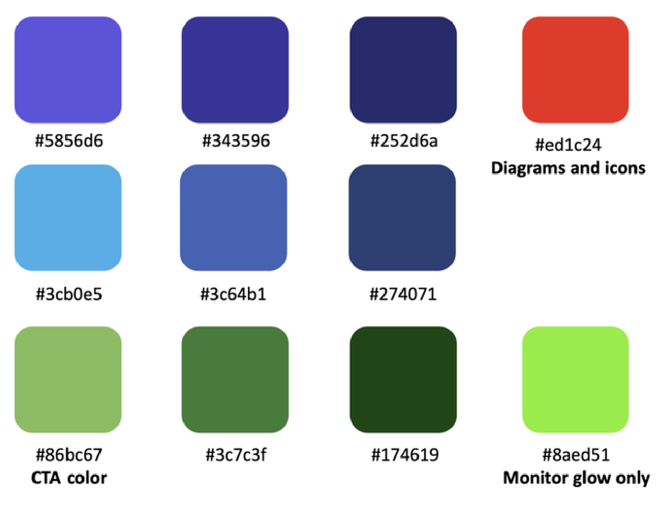
The primary palette centered on purple, blue, custom black, and grays, with a secondary palette of vibrant hues used to generate gradients and support CTAs, diagrams, and visual effects.
Working within this system, I noticed an over-reliance on purple that reduced contrast between elements, and a bright green reserved exclusively for CTAs that felt disconnected from the rest of the palette. These observations informed the simplification work I took on later in the role.
Primary Palette
Secondary Palette
Typography
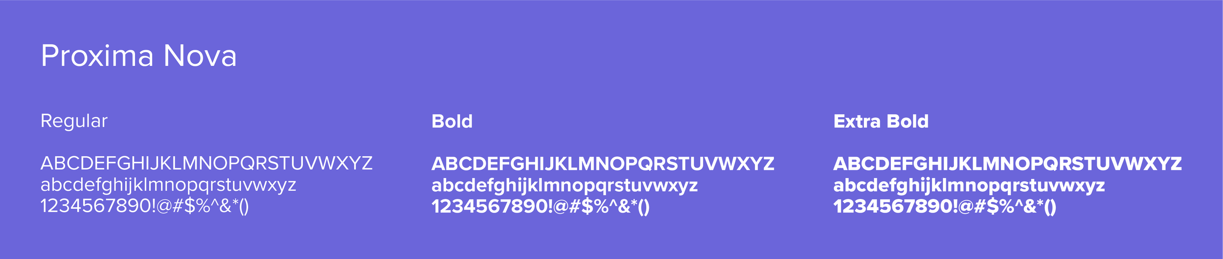
The primary typeface, Proxima Nova, is clean and geometric and performs well across print and web. Where licensing and technical limitations prevented its use across corporate systems and third-party platforms, Calibri served as the fallback for public-facing materials.
The gap between the two typefaces was noticeable and became one of the consistency issues I worked to address as the brand evolved.
Icons
The outlined iconography, available in dark and light variations, used the primary blue alongside white and custom black. The style aligned well with the brand's visual identity, though scalability limitations made the icons less adaptable across product and corporate contexts — something I kept in mind as I expanded the library to meet new needs.

Imagery
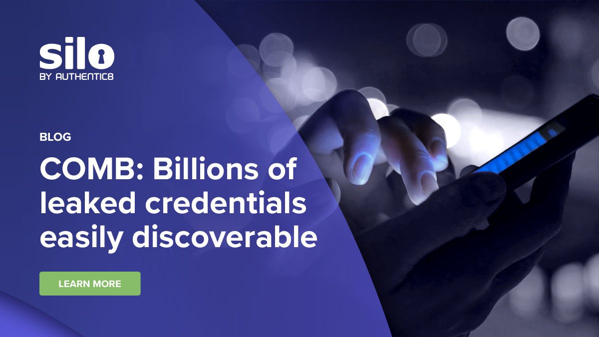
Corporate imagery was built around manipulated stock photos framed by brand layers that reinforced the theme of separation. A defining visual motif was the "swoosh," a layered element that contained text and anchored much of the imagery.
The system worked well in straightforward applications, but when a headline needed supporting subtext the layout became cluttered quickly. Before moving into a full refresh, I began making incremental changes — scaling back the swoosh, reducing content density based on the context of each piece, and introducing alternative framing approaches. Customer quotes, for example, moved away from the swoosh entirely in favor of large typographic treatments that let the words carry more visual weight. I also began incorporating video as a background element in place of still images, which added motion and depth without changing the underlying brand.
These changes informed how I approached the full refresh that followed.



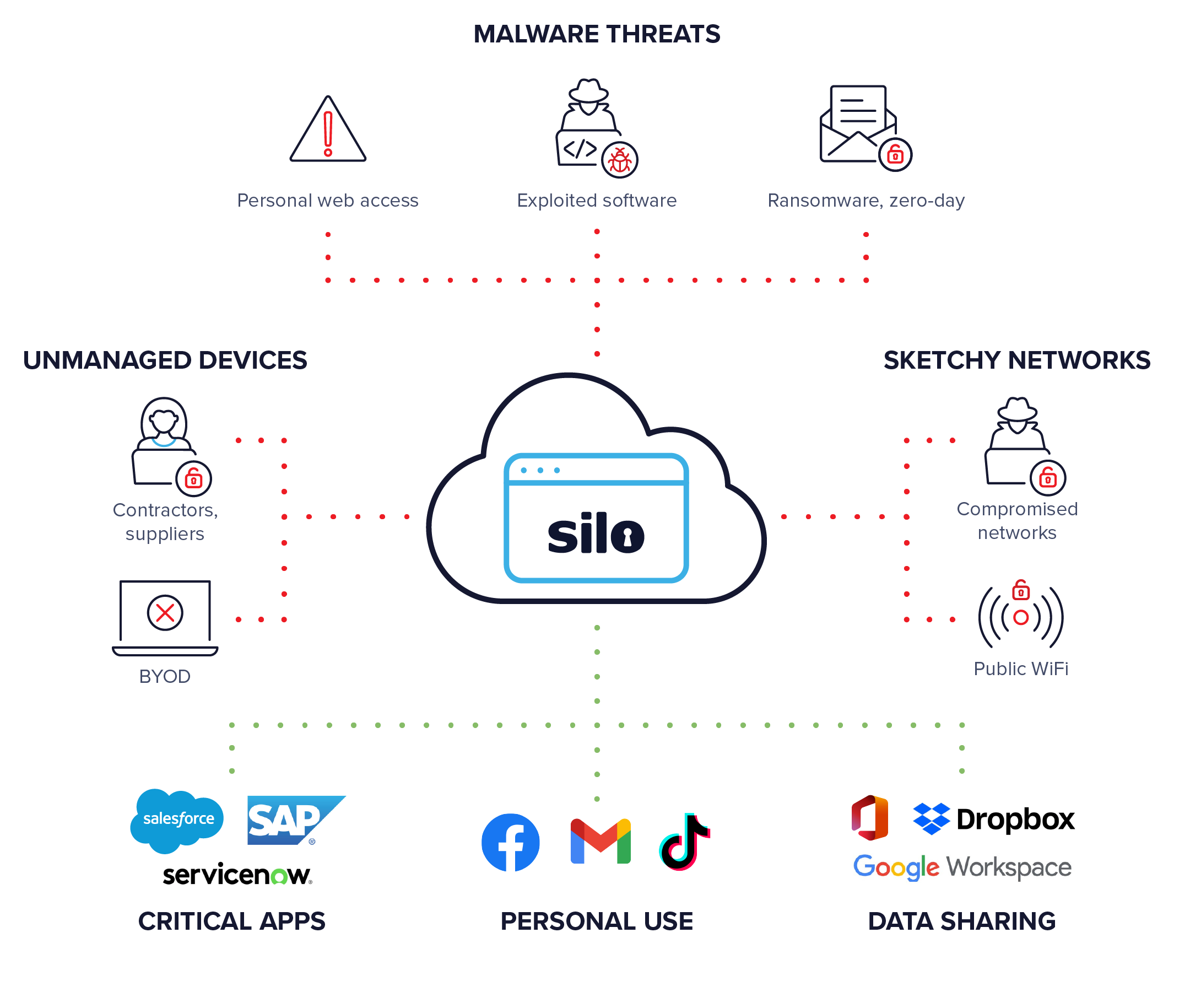
Infographics
Branding Updates
With the incremental changes behind me, I moved into a more deliberate refresh. The brand was under three years old, so a full overhaul wasn't the goal; the focus was on simplifying and modernizing what was already there.
The most significant change was the role of the swoosh. Rather than removing it, I repurposed it as a grounding element to frame content rather than dominate it. From there I scaled back gradients and drop shadows, repurposed other key brand elements as secondary accents, and leaned into negative space to give designs more room to breathe. The result was a cleaner, more modern aesthetic that kept the core identity intact while improving clarity and consistency across every touchpoint.
Additional Headline Typeface
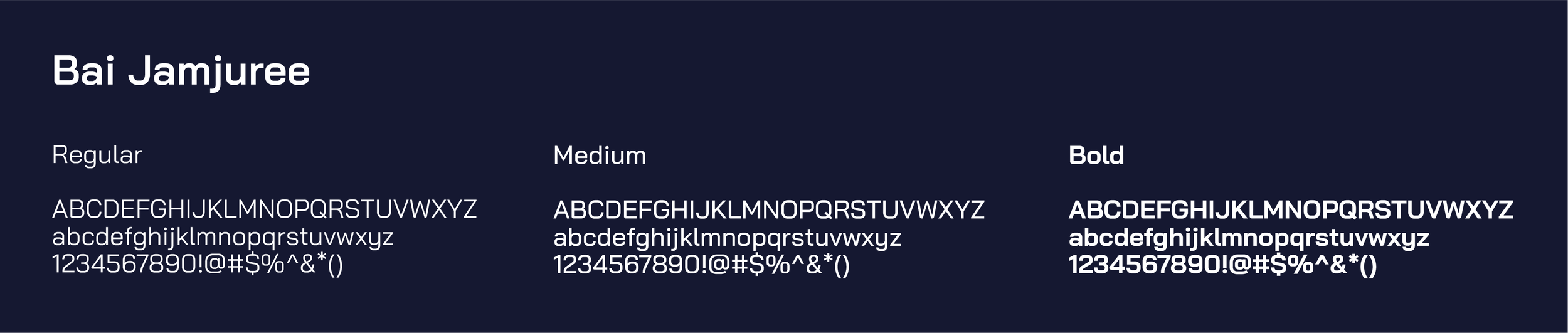
To add more diversity to the brand, I introduced a secondary typeface for headlines, improving the typographic hierarchy and giving the brand a fresher look without straying from the overall style.
Motion Graphics
Motion graphics were another area I pushed to expand. I introduced motion into the marketing mix through a new product demo experience and by adapting the NeedleStack podcast for YouTube Shorts, keeping both projects consistent with their respective brand guidelines.




A few examples of these motion graphics in context.
Documents
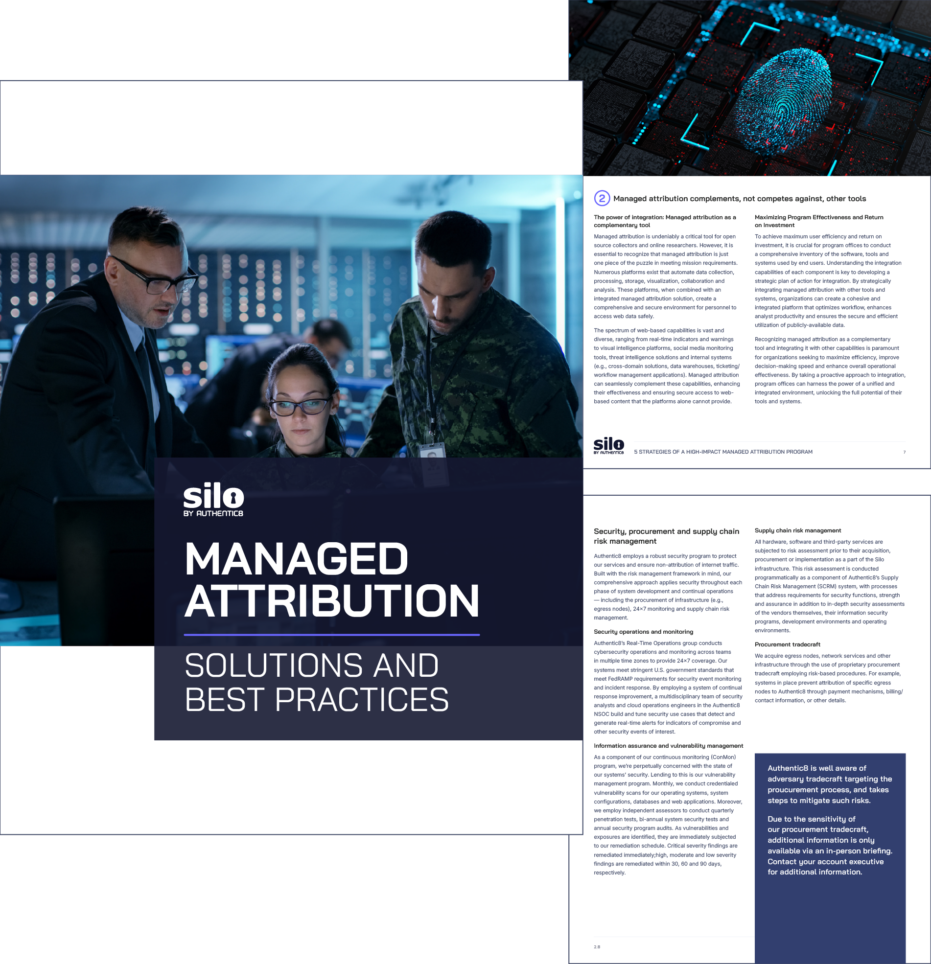
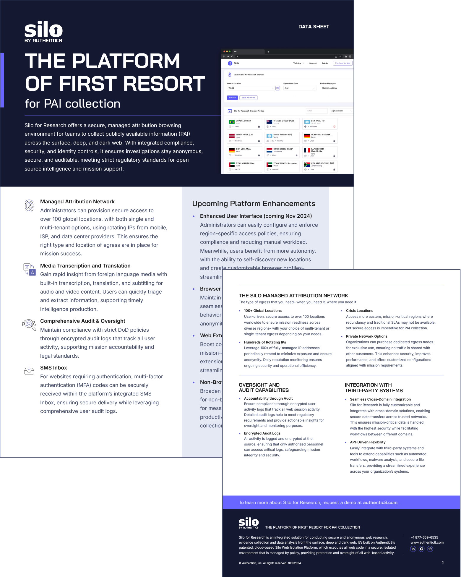
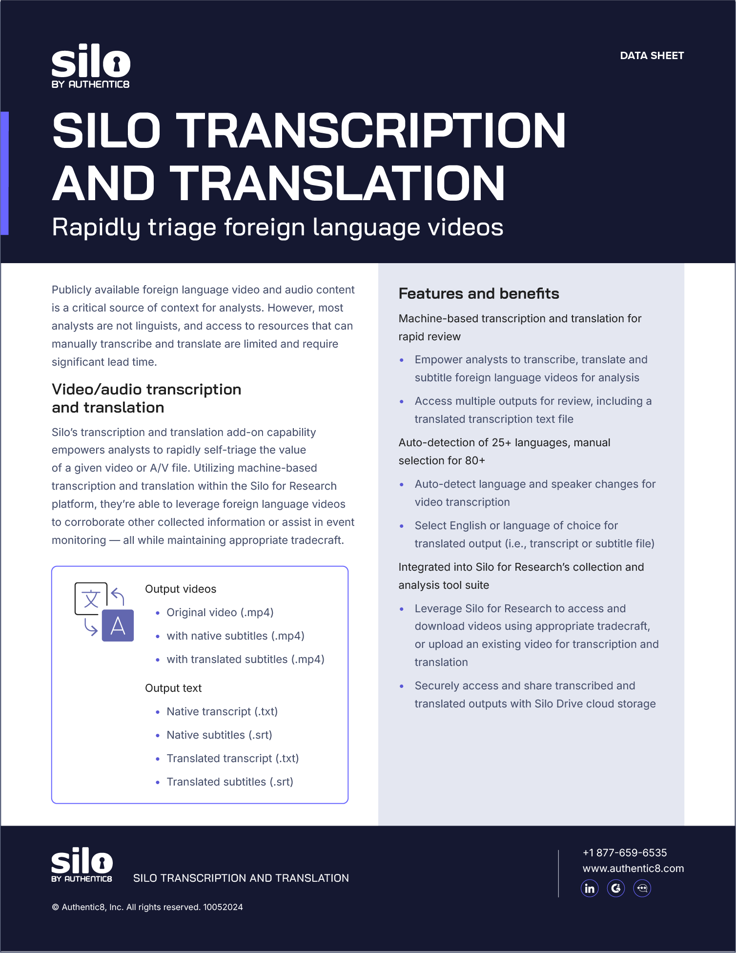
Originally, Authentic8's white papers and documentation had no grid system and were essentially walls of text with no visual structure. I introduced a layout built on a clear grid and typographic hierarchy, making the content easier to navigate and the documents more consistent with the overall brand.
Trade Show
For trade show materials, we leaned into white space as a deliberate differentiator. Cybersecurity brands tend toward darker palettes, and a lighter, more open aesthetic was a simple way to stand out on a crowded show floor.


