Silo Workspace
Product Design
From September 2023 to June 2024, I designed the UI for Silo Workspace, a new product from Authentic8 built on the foundation of their existing Silo for Research browser. Silo Workspace is a cloud-based platform designed for security analysts to conduct research across the surface, deep, and dark web without exposing their identity.
It was a large cross-functional effort between the Marketing and Product teams. I worked directly with our UX designer, translating her direction for the user experience into the visual interface, while also taking on the product branding. The project ran alongside a full refresh of Authentic8.com, with the goal of creating a consistent experience across the brand and product.
Silo Workspace has since been recognized with the OSMOSIS Association's 2026 OSINT Technology Innovation of the Year award.
Tools
Research and discovery
To ground the new product in user needs, our Product Manager conducted a series of interviews with existing Silo for Research users, primarily threat analysts in the cybersecurity field, and developed personas from the findings. My role was to translate those insights into design decisions.
Two themes came up consistently: frustration with the number of disconnected tools needed to conduct research safely, and delays caused by setting up a secure triage environment before work could even begin. These findings pointed toward a clear opportunity to build a unified platform that consolidated key functionality into a single, faster workflow.
The personas below capture the three primary user types that shaped our design decisions.


Prototyping
The goal was to build Silo Workspace as a modular, widget-based system. Users could conduct isolated research sessions in the cloud browser while customizing their dashboard with additional tools and third-party integrations. Planned features at launch included an RSS intel feed, Silo cloud storage, and integration with Authentic8's Collector product.
We worked closely with the engineering team around an open-source map that allowed for rapid customization. From there, wireframes explored how users might interact with different widget configurations, followed by low-fidelity prototypes that focused on the functional content of each widget while staying consistent with Authentic8's existing branding.
Wireframes


Low Fidelity


Color and Typography
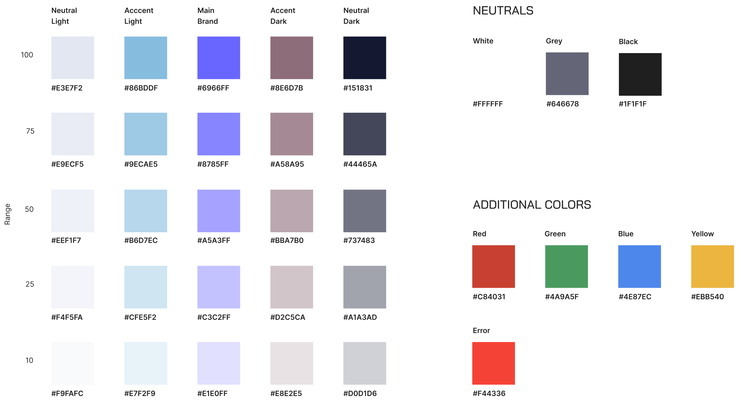
The prototyping phase opened up a conversation about updating the corporate color palette and typography, a natural opportunity given we were building a new product and planning a brand refresh in parallel. The addition of light and dark mode also meant the palette needed to be more flexible than before.
After several iterations, I landed on a neutral color spectrum that complemented our core purple, brightened for a more modern appearance. The palette expanded to include greys, blacks, and accent colors for file type differentiation, with purple reserved for main branding, CTAs, and headline icons.
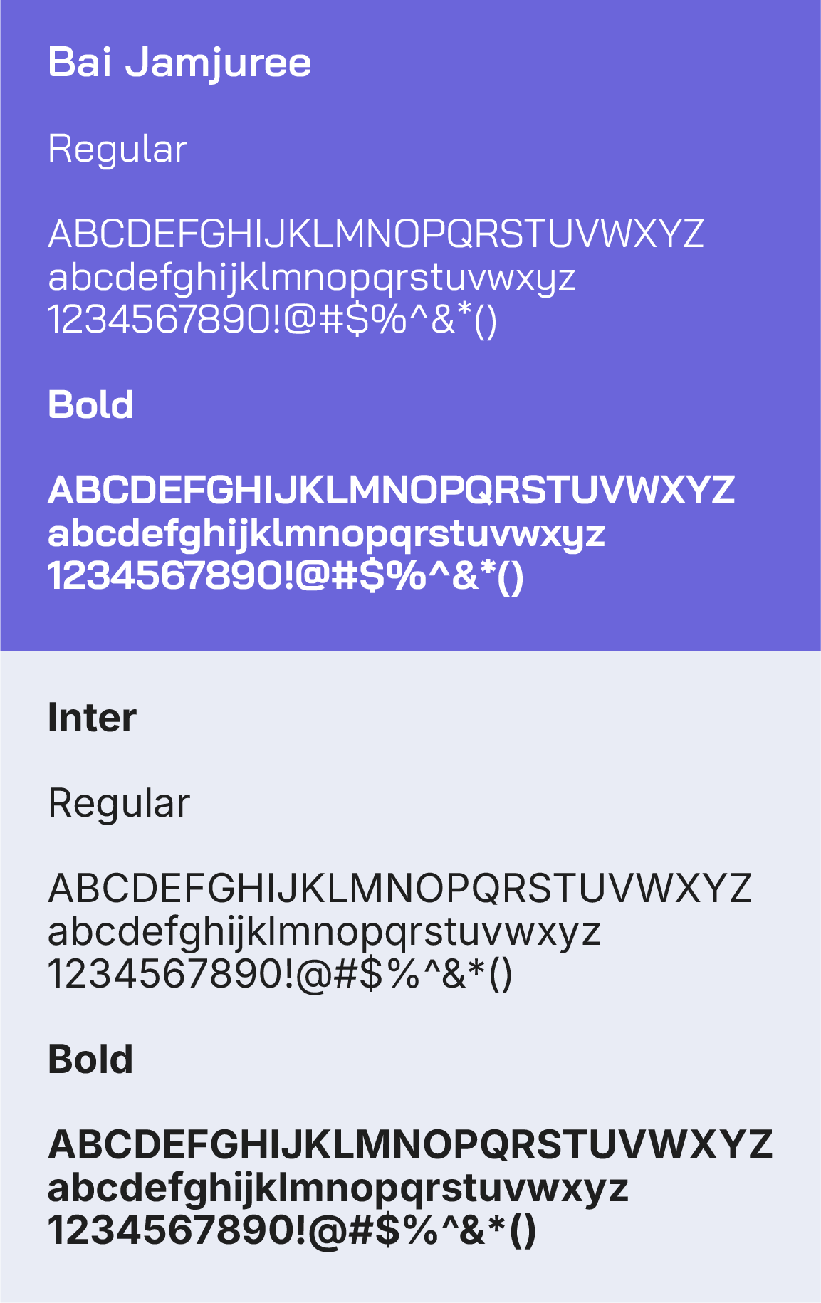
For typography, I moved away from Proxima Nova toward a combination of Bai Jamjuree for headlines and Inter for body copy. Bai Jamjuree has a tech-forward quality without feeling like a cliché, and Inter keeps body text clean and readable. Both are web-based fonts that integrated cleanly into Google Workspace, which helped maintain consistency across digital and print.
These updates also informed the broader brand refresh covered in the Authentic8 case study.
Icons
I developed a custom icon set for the platform, using the Material Design library as a foundation for system-level icons to keep development moving efficiently. The previous icon set used outlined designs that didn't scale well at smaller sizes, so I shifted to filled elements that stay legible across all sizes.
The palette moved to a monochromatic scheme built around our core purple, simplifying the previous duo-tone approach. I also created more stylized icons for empty states to give users a clear visual cue to prompt action, a style that extended to registration emails to keep the experience consistent throughout.
Accessibility
Accessibility was a priority throughout, particularly around color contrast and color blindness validation. The interactive map feature was the most complex area to navigate, it included a global terminator for day/night distinctions, and certain color combinations blended together or lost prominence under different vision simulations.
We tested across multiple color blindness profiles, adjusting the palette where needed. The map's dark web egress mode required particular attention to ensure it remained visually distinct while meeting accessibility standards.


Deuteranopia

Protanopia

Deuteranomaly
Protanomaly
Final Design
The final designs reflect a product built around the people using it. Every decision, from the modular layout to the accessible color system, was made with analysts in mind: people who need to move fast, stay secure, and work without friction.


